
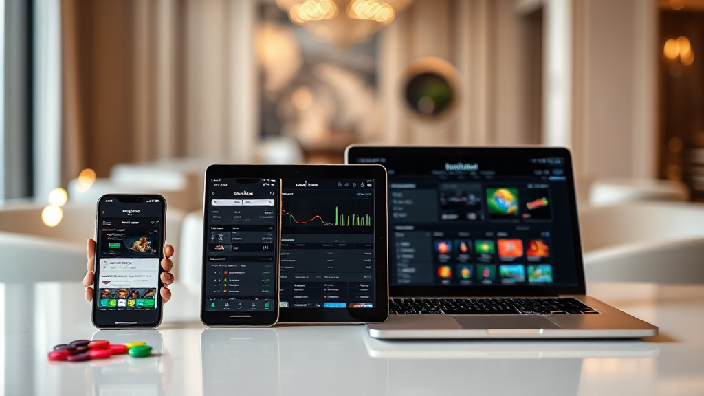
How tk999 Looks on Phones, Tablets and Desktop
The same platform rarely behaves the same way on every screen. A layout that feels generous on a desktop monitor can feel cramped on a small phone, and a design that looks tidy on a phone can leave awkward empty space on a tablet. That is why I spent time opening tk999 across a range of devices and window sizes instead of judging it from a single screenshot. This is a compatibility report, not a sales pitch: I looked at layout behaviour, input methods, and the practical friction a Bangladeshi user is likely to notice in daily use.
My test set was deliberately ordinary rather than exotic. For phones I used a compact 5.5-inch class handset with a 720p panel, a mainstream 6.1-inch device, and a larger 6.7-inch model. For tablets I used a 10.9-inch slate in both portrait and landscape. For desktop I used a 1366×768 laptop, a 1920×1080 monitor, and a wide 2560×1080 window. I also throttled the connection to a slow 3G profile for part of the testing, because device compatibility is not only about pixels — it is also about how a page responds when the network is weak.
Small phones: the tightest test
The compact phone is where most layouts fail first, and it is the fairest place to begin. On the 5.5-inch screen, the header collapsed into a compact bar with the brand mark on the left and a menu control on the right. Nothing overlapped, and the main content column filled the width without forcing a horizontal scroll. That last point matters more than it sounds: a single element that refuses to shrink can push an entire page sideways, and I did not see that happen here.
Text sizing was readable without zooming, though long paragraphs sat close to the edges. The tap targets were large enough to hit accurately with a thumb, which is the real test on a small handset. Where the layout impressed me was in how it handled the parts of the interface that are usually dense — lists, form fields and buttons. These stacked vertically instead of trying to sit side by side, which is the correct choice when horizontal space is scarce.
The main trade-off on small screens is scrolling depth. Because sections stack, the page becomes longer, and a user who wants to reach something near the bottom will do more swiping. That is a normal consequence of responsive design rather than a defect, but it does mean the order of content matters. On this screen, the most-used actions appeared before the informational blocks, which kept the extra scrolling from feeling punitive.
Mid-size and large phones: the comfortable middle
Moving to the 6.1-inch and 6.7-inch handsets, the same layout gained breathing room. Margins widened slightly, line lengths became easier to track, and the spacing between interactive elements increased. This is the size band most Bangladeshi users will actually carry, so it is worth describing carefully.
On the larger phone, I noticed that some content began to arrange itself into two columns where the small phone had used one. That transition happened cleanly, with no half-broken rows or orphaned elements. Orientation changes were also handled well: rotating to landscape widened the content area, and rotating back restored the portrait layout without leaving anything stranded off-screen.
Input behaviour on phones is mostly touch, and the platform respects that. Buttons respond to a tap rather than requiring a precise press, and form fields summon the correct keyboard type. When I tested with a slow connection, the page did not collapse into a blank screen; content appeared progressively, which is far less frustrating than waiting for everything at once. For anyone who primarily uses a phone, the experience is coherent rather than merely tolerated.
Tablets: the in-between case
Tablets are the awkward middle child of responsive design, and I always check them separately because they expose lazy breakpoints. On the 10.9-inch slate in portrait, the layout used a centred column with generous side margins. That is a safe choice, though it does leave noticeable unused space at the edges. In landscape, the wider canvas allowed more content to sit side by side, and the page felt closer to a desktop arrangement.
The tablet also revealed something useful about input. Touch still dominates, but the larger surface means users often rest the device on a stand and interact with a fingertip rather than a thumb. Tap targets that felt adequate on a phone felt slightly small here, though still workable. I did not encounter any element that required a mouse-level precision to activate.
One practical note for tablet users: because the portrait layout centres a narrower column, the visual hierarchy becomes very clear. Headings and primary actions stand out more than they do on a phone, where everything competes for the same narrow strip. If you read rather than tap, the tablet is arguably the most pleasant of the three form factors.
Desktop browsers: width, precision and hover
On the 1366×768 laptop, the layout expanded to use the available width without stretching text to uncomfortable line lengths. On the 1920×1080 monitor, additional whitespace appeared around the content rather than inside it, which kept the reading experience stable. The ultrawide window was the most interesting test: instead of stretching a single column across the full width, the layout kept a sensible maximum and let the extra space fall to the sides.
Desktop input is where the experience changes character. A mouse or trackpad allows precise clicking, and hover states become available. I found that interactive elements gave clear visual feedback on hover, which is a small detail that reduces mis-clicks. Keyboard navigation also worked: tabbing moved focus through interactive elements in a logical order, and focused elements were visibly outlined rather than silently selected.
The desktop version also felt faster to scan. More content fits above the fold, so fewer scrolls are needed to survey the page. That said, the extra width is not always an advantage — on very wide monitors, a centred column can feel isolated, and users who expect a full-bleed dashboard may find the margins surprising. It is a deliberate readability trade-off rather than an oversight.
Cross-device consistency and what it means in practice
After cycling through all of these screens, the pattern that emerged was consistency of structure rather than pixel-for-pixel sameness. The same sections appear in the same order everywhere; only their arrangement changes. That is the right approach, because it means a user who learns the layout on a phone can find the same things on a laptop without relearning the interface.
A few practical takeaways stand out. First, small phones get a single-column, thumb-friendly layout that avoids horizontal scrolling — the most important compatibility win. Second, mid-size and large phones get the most balanced experience, with clean breakpoints and sensible orientation handling. Third, tablets get a readable centred layout in portrait and a wider arrangement in landscape, with touch input that remains workable. Fourth, desktop browsers benefit from precise input, hover feedback and keyboard navigation, with content width capped for readability.
There are also limits worth stating honestly. I tested a handful of representative devices, not every handset on the market, and real-world performance will vary with browser version, operating system and network quality. Very old browsers may not support the same layout behaviour, and extremely small or unusually shaped screens could still produce edge cases. Compatibility testing reduces surprises; it does not eliminate them.
If you want to check these observations against your own device, the most useful exercise is to open the platform on the screen you actually use, rotate it, and try the actions you perform most often. Layout behaviour is easy to describe but easier to judge first-hand. What I can say from this round of testing is that the platform adapts across phone, tablet and desktop form factors with a consistent structure, sensible breakpoints and input methods that match the device in your hand. That is a solid foundation, and it is the kind of compatibility that matters more than any single screenshot.